Cast Study
Social Media Content Strategy for
"Ads Ministor", Our Agency
The Challenge
Most marketing agencies talk about social media strategy. Few actually practice it on their own channels with the same discipline they bring to client work. The Adsministor social media feed faced the same challenge every content creator faces — how do you stop someone mid-scroll, earn their attention in under two seconds, and make them want to read more — consistently, post after post, month after month?
Random good posts don't build a brand. Consistent visual systems do.
The goal wasn't just to create attractive content. It was to build a recognisable visual identity for Adsministor's social media presence — one where a follower could see a post in their feed without reading the handle and immediately know it was ours.
The Strategy: Visual Hooks Built Like Magazine Covers
The creative direction was inspired by one of the oldest and most proven attention-grabbing formats in existence: the magazine cover.
Magazine covers have been stopping people in crowded spaces for over a century. They work because they follow a strict hierarchy — one dominant word or image that earns the glance, supporting copy that earns the read, and a consistent design system that builds brand recognition over time.
We applied that exact logic to social media.
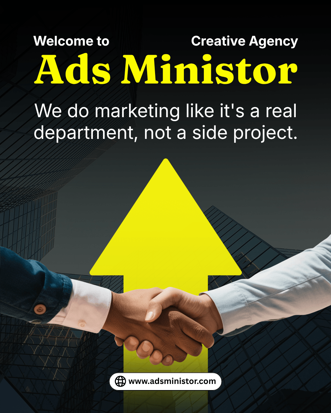
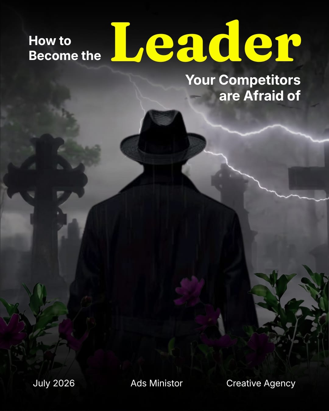
Every post in the Adsministor feed is built around three deliberate layers:
Layer 1 — The Visual Hook (the stop)
A single cinematic, dramatic photograph fills the entire frame. Dark, moody, and high-contrast — chosen specifically to stand out against the typically bright, over-saturated content that dominates most social feeds. Where others go light, we go dark. Where others go busy, we go cinematic. The contrast alone earns the scroll-stop before a single word is read.
Layer 2 — The Typography Hook (the grab)
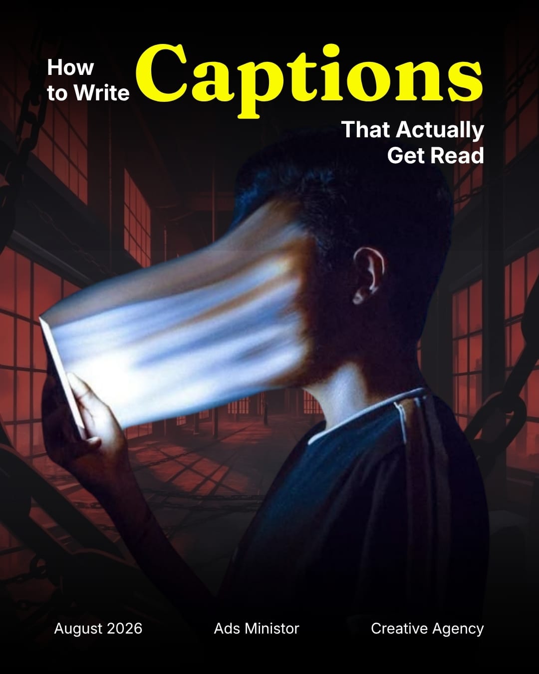
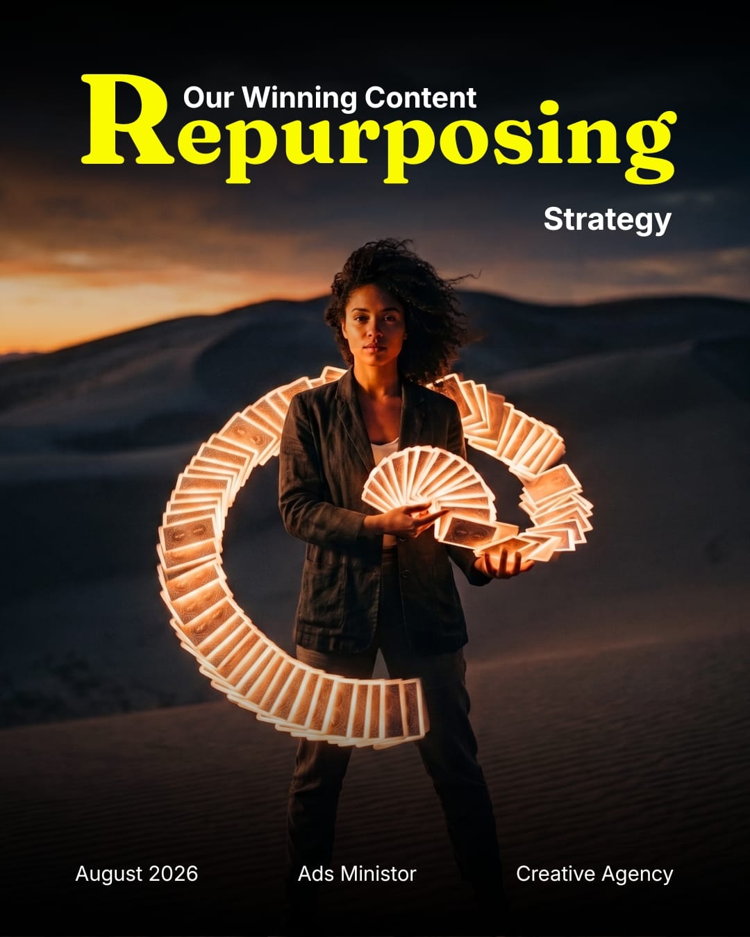
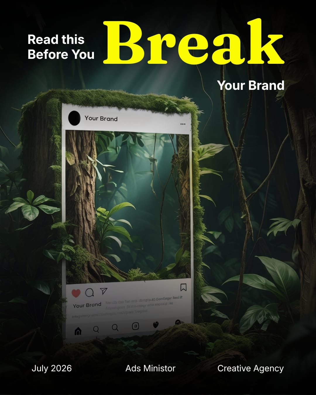
One single word — the most powerful word in the post's message — is set in a large, bold serif typeface in Adsministor's signature yellow. Not a sentence. Not a tagline. One word. "Break." "Repurposing." "Captions." That word does one job: make the viewer curious enough to read the supporting copy around it.
The yellow was chosen deliberately. Against the dark cinematic photography, yellow creates maximum contrast and immediately draws the eye to the most important word on the page — the same psychological principle used in road signs and warning labels, applied here to earn attention rather than signal danger.
Layer 3 — The Copy Hook (the read)
Smaller white supporting text surrounds the bold yellow word, completing the headline and giving context. "Read this Before You Break Your Brand." "Our Winning Content Repurposing Strategy." "How to Write Captions That Actually Get Read." The supporting copy is written as an incomplete thought — it answers the yellow word's implied question with a phrase that's compelling enough to make the viewer want to tap through and read the full post.
Design Consistency: Why It Matters More Than Individual Posts
Each of the three posts shown spans two months — July 2026 and August 2026. Despite different topics, different photography, and different subject matter, every post is immediately recognisable as Adsministor content. That consistency is not accidental — it is the strategy.
Here's what stays consistent across every post:
The dark cinematic photography style — no bright stock images, no flat illustrations. Every background image is dramatic, cinematic, and high-contrast. This is Adsministor's visual signature.
The bold yellow serif headline word — the same typeface, the same color (#C8FF00 yellow), the same dominant sizing on every post. A follower who has seen three posts learns to expect it. That expectation is brand recognition being built in real time.
The black framed border — each post sits inside a consistent black border that acts as a frame, separating the content from the surrounding feed and giving every post a polished, editorial quality.
The footer branding — date, "Ads Ministor," and "Creative Agency" appear at the bottom of every post in the same position, same size, same style. It's a quiet but consistent brand stamp that reinforces who made this without competing for attention with the content itself.
The magazine layout structure — every post follows the same information hierarchy: cinematic background, bold yellow hook word, white supporting copy, footer branding. Same structure, different content. That's the formula.
Why This Works: The Psychology Behind Visual Hooks
Contrast stops the scroll. The human eye is wired to notice difference, not sameness. A dark, cinematic image in a feed full of bright, colorful content creates an immediate pattern interrupt — the brain notices it before the conscious mind does.
One bold word creates curiosity faster than a sentence. Reading takes time. A single bold word — especially one with emotional or provocative weight like "Break" — registers instantly and creates an open loop in the viewer's mind. The brain wants to close that loop, so it reads on.
Consistency builds recognition over time. Each time a follower sees a post in this style, the recognition is faster than the last time. After three posts, they begin to associate the style with Adsministor. After ten, they recognize it before they consciously read the handle. That is brand equity being built for free, post by post.
Magazine-style design signals authority. The editorial layout — the serif typography, the cinematic photography, the structured hierarchy — communicates that this content was considered and crafted, not quickly thrown together. Authority in design creates trust in content before a word is read.
The Three Posts: Content Breakdown
Post 1 — July 2026
"Read this Before You Break Your Brand"
Hook word: Break — emotionally charged, slightly alarming, creates immediate concern for any business owner who cares about their brand. The jungle background with an Instagram frame mockup visually reinforces the digital branding theme.
Post 2 — August 2026
"Our Winning Content Repurposing Strategy"
Hook word: Repurposing — a high-value marketing topic for any business owner trying to get more from their existing content. The desert landscape with a figure holding a glowing circular light reinforces the idea of creating something new from what already exists.
Post 3 — August 2026
"How to Write Captions That Actually Get Read"
Hook word: Captions — directly relevant to any business running social media. The dramatic light-and-motion photography creates a sense of speed and urgency that complements the caption writing topic.
All three posts lead with high-value educational content — a deliberate choice. Adsministor's social media isn't built to sell directly. It's built to demonstrate expertise, earn trust, and make the right audience think: "If this is the quality of their free content, imagine what working with them looks like."
The Result
A social media presence that looks like no other agency in the market — consistent, cinematic, and built on a visual system rather than individual posts. A feed that gets more recognisable with every post published. Content that earns attention through design discipline rather than boosted budget. And a brand that practices exactly what it sells.
This is what Adsministor brings to every client's content. The same strategic thinking. The same design discipline. The same commitment to content that stops the scroll and builds something lasting.
Ready to Grow?
Your next great video is just one conversation away. Whether you have a clear brief or just a rough idea, we'll help you shape it into something your audience will actually remember. Let's hop on a call.

Marketing shouldn't feel like guesswork. We're here to make sure it doesn't.


+94 77 461 1055
Copyright © 2026 Ads Ministor (Pvt) Ltd. All Rights Reserved.