Cast Study
Brand Identity Design for
Aroma LK
Case Study
Client: Aroma LK
Service: Brand Identity Design
Product: Luxury Perfume Brand
Brand Overview
AromaLK is a luxury fragrance and decant house offering premium Middle Eastern perfumes. The tagline is "Luxury in Every Drop." Every design decision flows from one positioning goal: elegant, minimal, and premium.
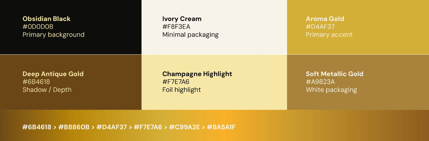
The Color System: Luxury Gold
Gold is the most deliberate choice in this entire identity. Here's why it works:
Gold psychologically signals wealth, exclusivity, and timelessness — the same reason luxury brands like Chanel, Dior, and Versace use it consistently. For a Middle Eastern fragrance brand specifically, gold carries cultural weight too — it references the richness of Arabian perfumery tradition, where oud and luxury scents have been intertwined with gold and opulence for centuries. It tells the audience "this isn't a drugstore fragrance" before they read a single word.
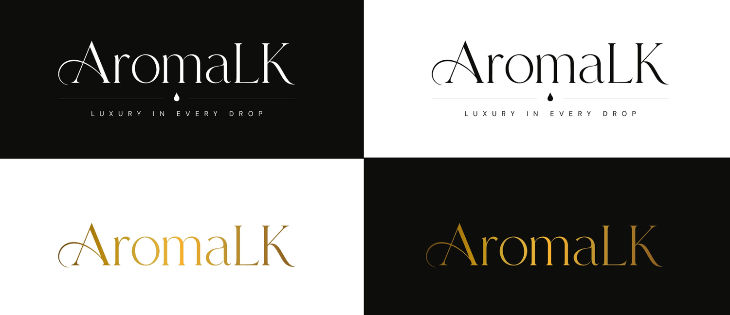
The Logo: Custom Serif Direction
A serif logo was chosen over a sans-serif for a very specific reason: serifs feel old, established, and trustworthy. They carry a sense of heritage and craftsmanship. For a luxury fragrance brand, you want to communicate that this isn't a trend — it's a timeless product.
The "letter-based" approach (using initials or a monogram) rather than a full wordmark is a classic luxury branding move — think LV for Louis Vuitton, YSL for Yves Saint Laurent. It creates a mark that works on packaging, bottle labels, and small surfaces without losing impact.
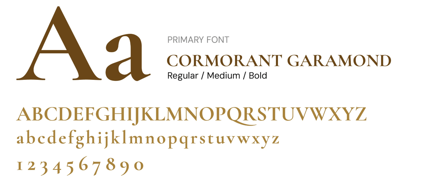
Typography: Luxury Hierarchy
Luxury brands use typography the way architects use space — deliberately and with restraint. The serif headline font carries the brand's personality (refined, elevated), while supporting typography stays minimal so nothing competes with the product itself. The rule in luxury branding is: the less visual noise, the more premium it feels.
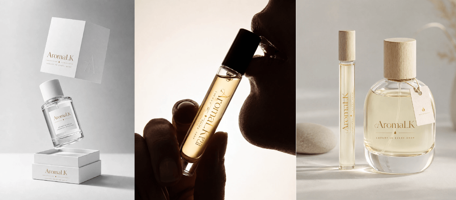
Minimal Aesthetic
Minimalism in luxury branding isn't laziness — it's strategy. When a brand strips everything back to only what's essential, it signals confidence. It says "our product is good enough to speak for itself." For a fragrance brand where the actual product is invisible (you smell it, not see it), the packaging and visual identity have to do enormous work. Keeping it minimal forces every remaining element — the gold, the serif, the spacing — to carry more weight and feel more intentional.
Tagline: "Luxury in Every Drop"
This tagline does three things simultaneously:
Sensory — "drop" references liquid, fragrance, the product itself
Emotional — "luxury" sets the positioning immediately
Accessible — "every drop" implies that even a small amount delivers the full luxury experience, which quietly addresses the decant model (selling smaller quantities of premium perfume)
It's short enough to fit on a label and strong enough to anchor the entire brand story.
Packaging Hierarchy
For a decant house specifically — where the same fragrance comes in different sizes — packaging hierarchy is critical. The design likely uses size, weight, and gold accents to differentiate between full bottles and decants while keeping the visual family consistent. This is what makes a product line feel like a collection rather than a random assortment.
Overall Brand Strategy
The entire identity is built around one insight: Middle Eastern luxury fragrances are a premium product in a crowded market. The way to win isn't to shout louder — it's to look more refined than everyone else. Gold, serifs, minimalism, and a sensory tagline all work together to make AromaLK look like it belongs next to the world's most prestigious fragrance houses.
Ready to Grow?
Your next great video is just one conversation away. Whether you have a clear brief or just a rough idea, we'll help you shape it into something your audience will actually remember. Let's hop on a call.
Marketing shouldn't feel like guesswork. We're here to make sure it doesn't.


+94 77 461 1055
Copyright © 2026 Ads Ministor (Pvt) Ltd. All Rights Reserved.