Cast Study
Brand Identity Design for
TakeDeel
Case Study
Client: TakeDeel
Service: Brand Identity Design
Product: Advertising Supplier
Brand Overview
TakeDeel.com is Sri Lanka's largest free advertising platform — a place where people buy, sell, find jobs, and connect with opportunities across the entire country. The challenge with branding a platform this broad is making one mark communicate everything at once: marketplace, trust, accessibility, and scale — without becoming cluttered or confusing.
They needed a brand identity that worked for two audiences simultaneously: sellers and advertisers posting listings, and buyers and job seekers browsing them. One logo had to speak to both.
The Challenge
TakeDeel is Sri Lanka's largest free advertising platform — a place where people buy, sell, find jobs, and connect with opportunities across the entire country. The challenge with branding a platform this broad is making one mark communicate everything at once: marketplace, trust, accessibility, and scale — without becoming cluttered or confusing.
They needed a brand identity that worked for two audiences simultaneously: sellers and advertisers posting listings, and buyers and job seekers browsing them. One logo had to speak to both — and it had to do it instantly, clearly, and memorably.
The Big Idea: A Logo That Works on Two Levels
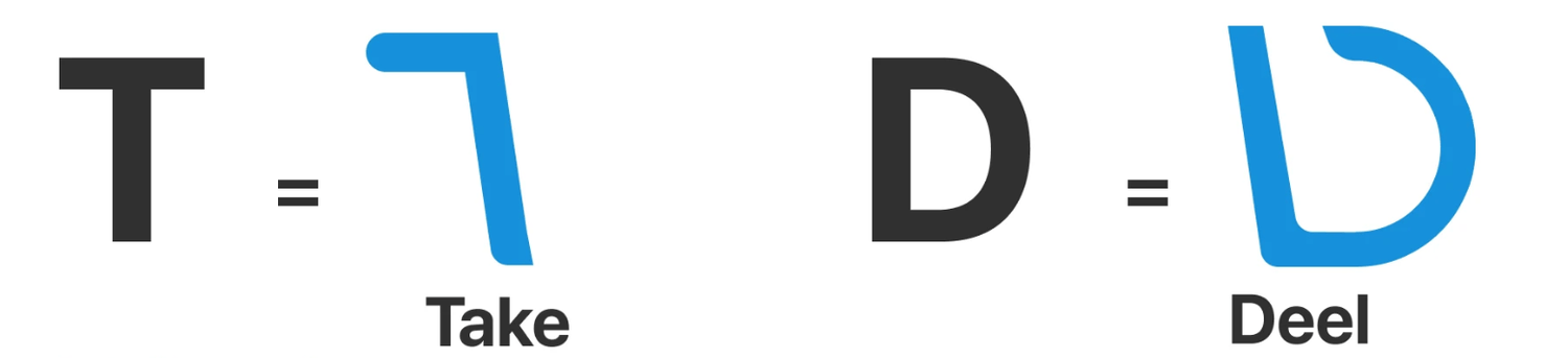
The centerpiece of this identity is one of the most strategically layered logo concepts in Sri Lankan digital branding — a TD monogram that simultaneously reads as a shopping cart.
The T forms the handle and left wall of the cart. The D forms the basket. Two small circles at the base complete the wheels. The result is a mark that works as an initial monogram for the brand name and as an instantly recognisable symbol of commerce — without either meaning feeling forced or accidental.
This is what great logo design does: it earns two impressions for the price of one.
The Logo Construction
The T and D were not taken off the shelf — each letter was custom drawn from scratch to make the shopping cart illusion work perfectly. The standard T is a rigid, angular form. The custom T used here has its crossbar shortened and its stem angled subtly to suggest the handle of a cart. The standard D is a closed curve. The custom D opens slightly at the top and base to create the characteristic open mouth of a shopping basket.
Neither letter looks forced in isolation — both are clean, modern, and readable as individual initials. But together, they transform into something else entirely. That dual readability is extremely difficult to achieve and is the mark of a highly considered design process.
Logo Variations: Built for Every Context
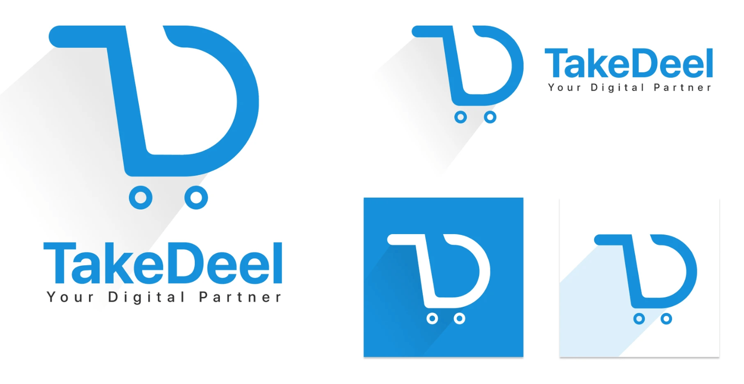
The identity was delivered in five distinct variations, each serving a specific use case:
Large standalone icon — the full TD shopping cart mark used as a hero element, app icon, or favicon
Horizontal lockup — icon paired with the wordmark "TakeDeel" and tagline "Your Digital Partner" for website headers and marketing materials
Compact horizontal — a smaller version of the same lockup for tight spaces and mobile interfaces
Reversed version — white icon on the primary blue background for dark backgrounds, social media profile images, and digital banners
Ghost/outline version — a light blue outline variant for watermarks, subtle brand applications, and backgrounds
This system ensures TakeDeel looks consistent and intentional whether it appears on a billboard in Colombo, a mobile app icon, or a social media post — at any scale, on any background.
The Color Palette: Three Colors, One Clear Purpose
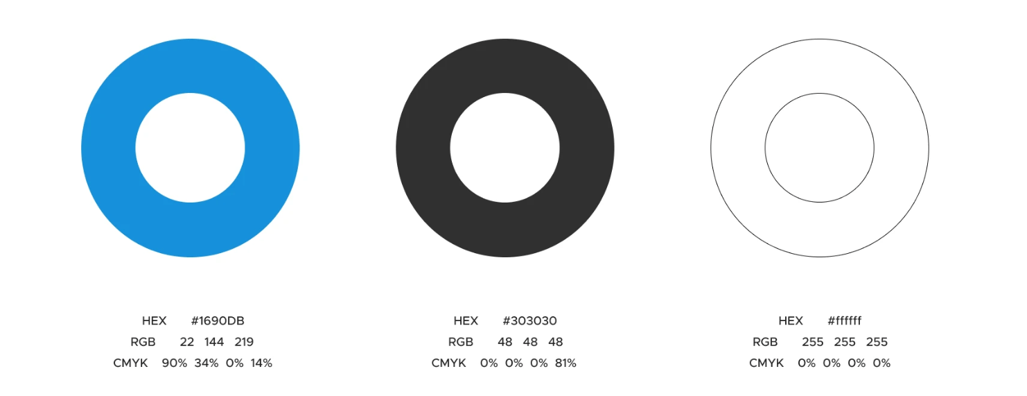
The identity is built on a precise three-color system:
Primary Blue — #1690DB (RGB: 22, 144, 219)
This is the brand's dominant color and its most important strategic decision. #1690DB is a bright, open, digital-native blue — clear, energetic, and universally associated with trust, reliability, and technology. For a free classifieds platform asking Sri Lankans to trust it with their buying, selling, and job searching, blue is the right choice at a psychological level. It sits in the same color family as globally trusted platforms — immediately signalling that TakeDeel is a credible, professional digital destination. The specific tone chosen avoids being too corporate (which would feel cold) or too bright (which would feel cheap) — landing exactly in the sweet spot of approachable trust.
Dark Charcoal — #303030 (RGB: 48, 48, 48)
Rather than pure black (#000000), the identity uses a soft charcoal for body text and secondary elements. This is a deliberate refinement — pure black alongside a bright blue can feel harsh and aggressive. #303030 is warm enough to feel human and readable on screen, while dark enough to maintain clear contrast. It keeps the identity feeling modern and digital rather than print-heavy.
White — #ffffff
White serves as the canvas — clean, open, and uncluttered. It gives the blue room to breathe and reinforces the platform's promise of simplicity and accessibility. In the reversed logo variation, white becomes the active color — the icon punches out of the blue background with zero loss of clarity or impact.
Typography: SF Pro Display, Bold & Medium
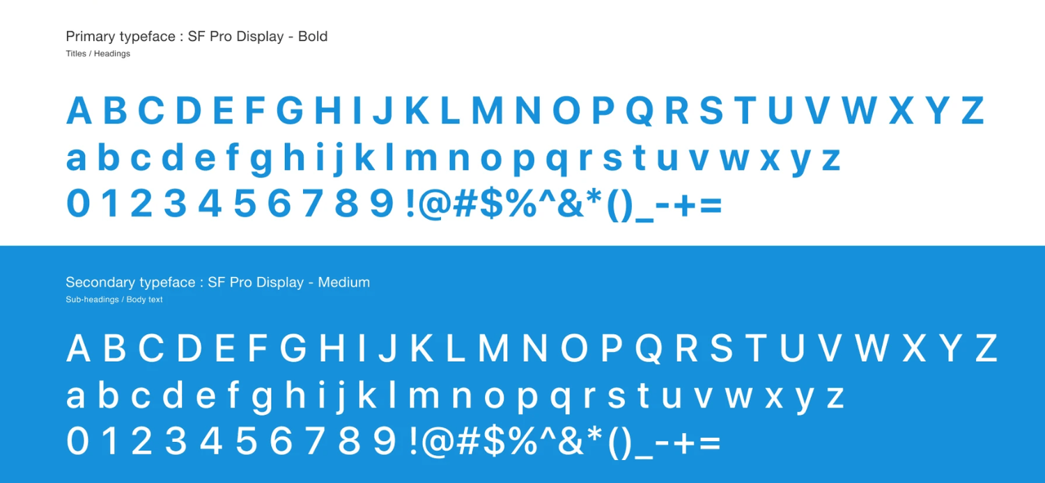
The identity uses a single typeface family across two weights — a decision that reflects both brand strategy and practical wisdom:
Primary: SF Pro Display Bold — Titles & Headings
SF Pro Display Bold brings authority and clarity to every headline. It's the same typeface family Apple uses across its entire ecosystem — which means it carries an inherent association with clean, premium digital product design. For TakeDeel, using Bold at heading level communicates confidence and scale — this is the largest free advertising platform in Sri Lanka, and its typography needed to feel like it.
Secondary: SF Pro Display Medium — Sub-headings & Body Text
Dropping to Medium weight for body copy creates a clear visual hierarchy without introducing a second typeface — which keeps the identity feeling cohesive and refined rather than fragmented. Medium is light enough to be comfortable at reading size, weighted enough to remain legible across both digital screens and printed materials.
Using one typeface family in two weights rather than two different fonts is a mark of typographic discipline — it keeps everything visually unified while still giving designers the hierarchy they need to structure information clearly.
The Tagline: "Your Digital Partner"
The tagline does something most taglines fail to do — it positions the platform as a relationship, not just a tool. "Partner" implies TakeDeel is on your side whether you're selling, buying, or job hunting. It's warm, inclusive, and works equally well for a small seller posting their first listing and a recruiter managing multiple job posts. Short, clear, and human — exactly right for a platform built to serve every corner of Sri Lanka.
The Result
A complete brand identity system built for scale — a custom logo that earns two meanings in one glance, a disciplined three-color palette that communicates trust at every touchpoint, a single refined typeface system that holds across digital and print, and a full set of logo variations ready for every application from app icons to outdoor advertising.
TakeDeel now has a visual identity that matches the ambition of the platform itself — clear, confident, and built to be Sri Lanka's most trusted digital marketplace for years to come.
Ready to Grow?
Your next great video is just one conversation away. Whether you have a clear brief or just a rough idea, we'll help you shape it into something your audience will actually remember. Let's hop on a call.

Marketing shouldn't feel like guesswork. We're here to make sure it doesn't.


+94 77 461 1055
Copyright © 2026 Ads Ministor (Pvt) Ltd. All Rights Reserved.